Charting Transport – A Treasure Trove of Insights
Melbourne, Victoria
Melbourne based Chris Loader is a long-time transport analytics expert. His current role is Manager, Network Analytics (Rail) at the Victorian Department of Transport.
In his spare time, he produces the Charting Transport website and blog. This site which is in the format of a single, extremely long page, is a treasure trove of data about Australian cities: where people live, how they move around and much more.
In the following article, with Mr Loader’s permission, we’ll highlight a tiny fraction of the charts available on that site and add very brief commentary. The commentary is our own. We don’t pretend to be experts and know that terminology is very specific when it comes to defining statistics. So for more accurate and in-depth explanations of each chart, we strongly recommend that you visit Charting Transport.
Whilst most (but far from all) of the charts and commentary on Charting Transport concern themselves with population distributions, motor vehicle and rail transport, all of these factors have a direct impact upon micromobility.
It All Starts With Density
Micromobility transport solutions work most effectively when population density is higher.
So let’s start with five animated maps, showing the progression of population densities over recent years in Australia’s five largest cities, which between them are home to over 16 million people, approaching two-thirds of all Australians.
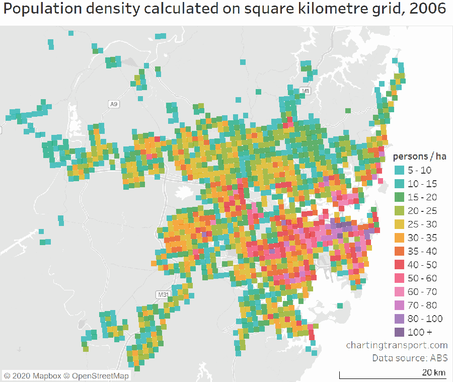
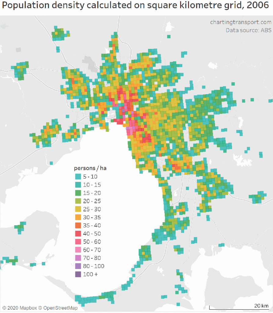
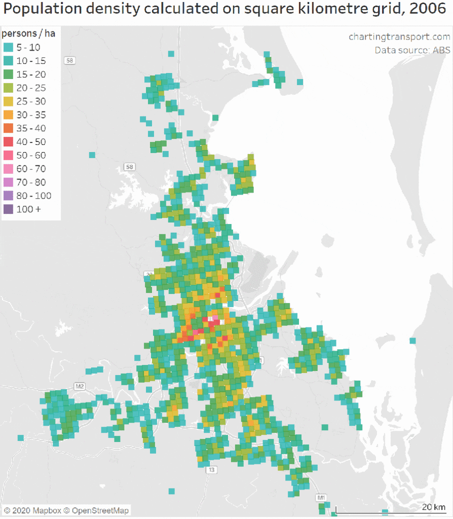
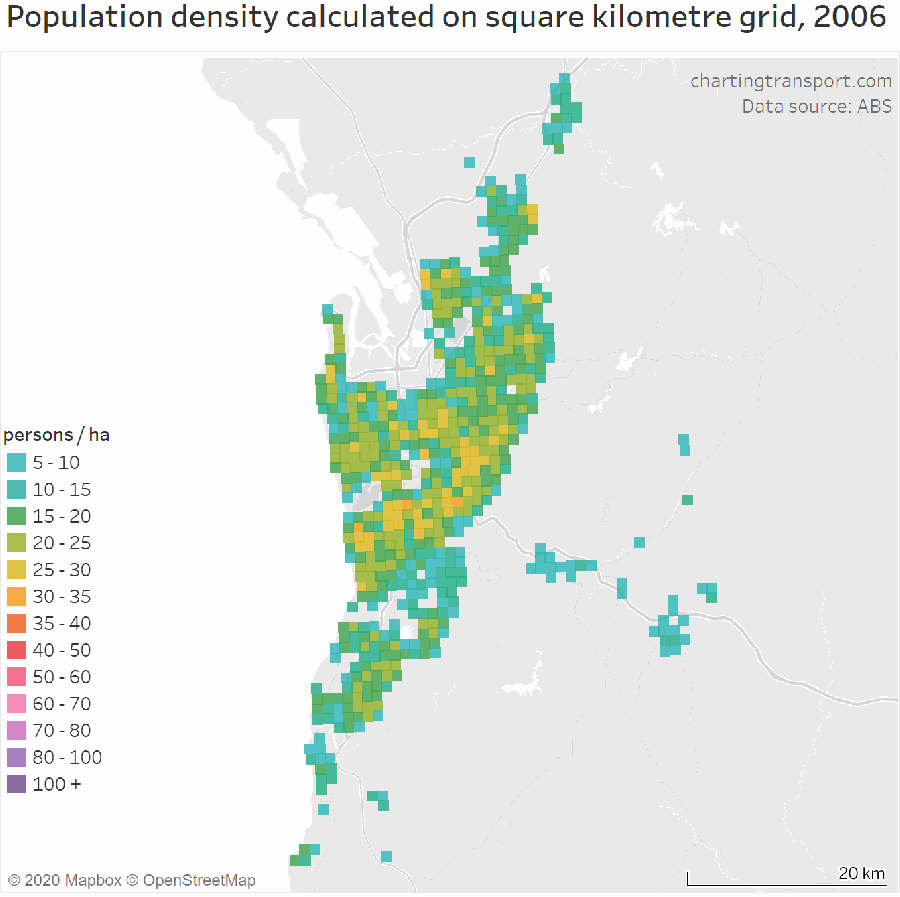
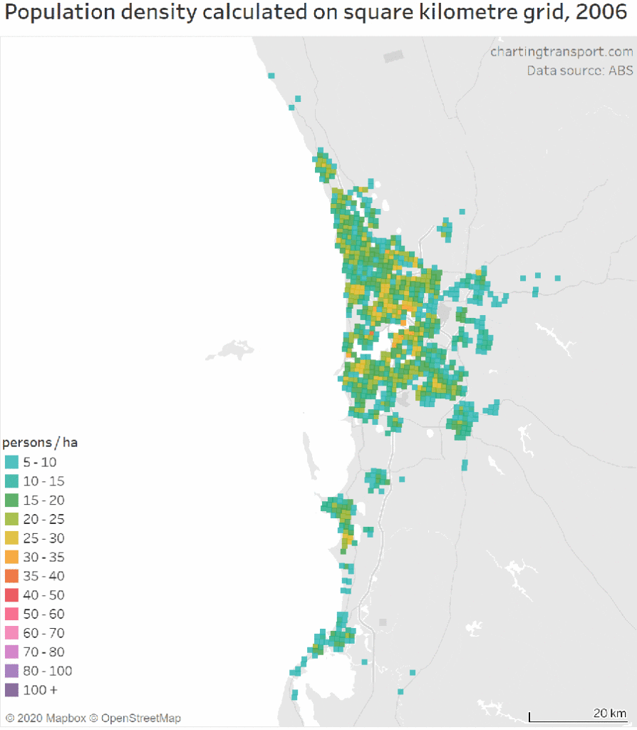
Here are animated gifs showing population density over time for the five largest Australian capital cities. Please click on either the arrows at either side of each image or on the dots below to move from one city to another.
As you’ll see from these five animated files, population densities are increasing, which is a positive trend for micromobility.
You’ll also see that the variation in density between the outer and inner suburbs is not just a few percent, or even 100%, but in some cases 1,000% or more. In other words, the densest areas are 10 to 20 times more densely populated than the most sparsely populated outer suburbs.
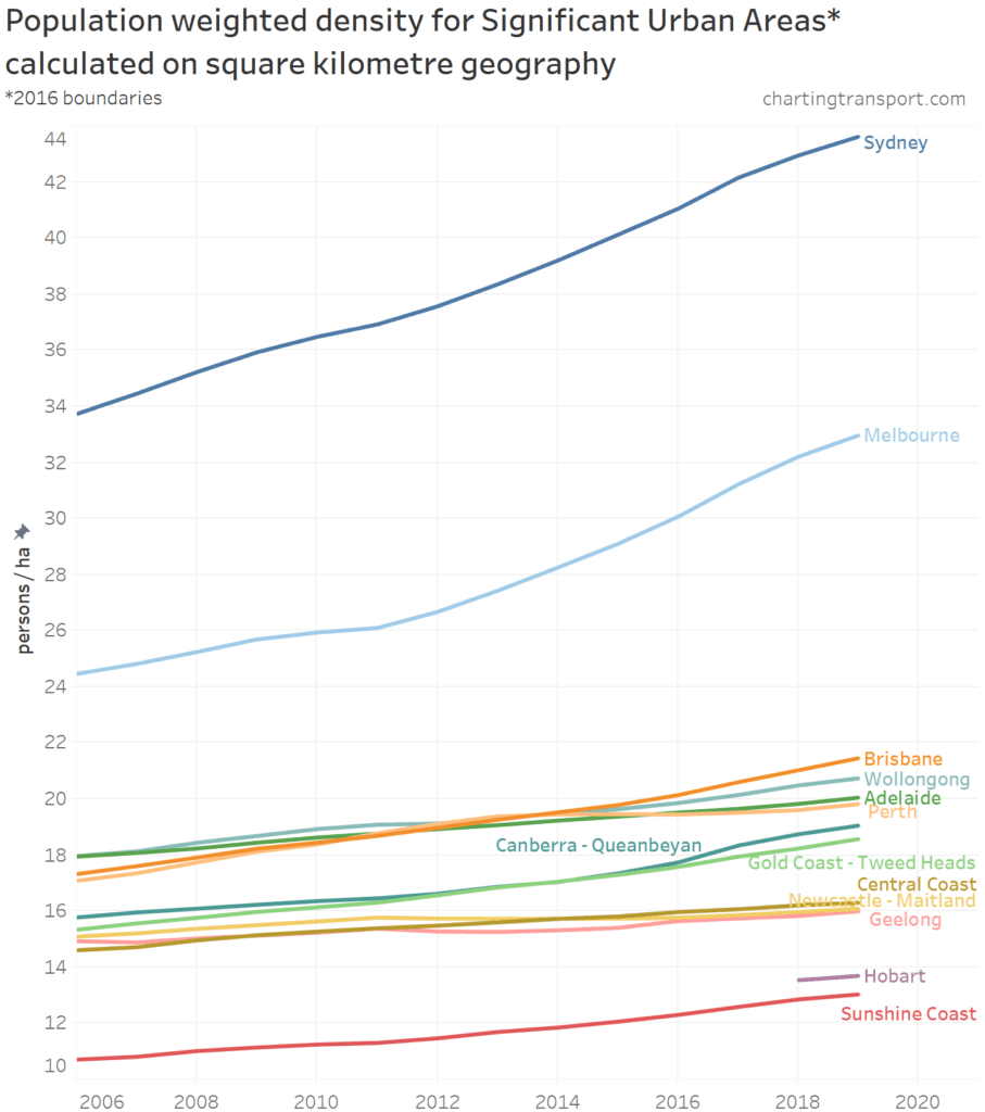
Summarising the data from multiple cities into a single chart you can see that Sydney is by far the most densely populated city, over 30% more densely populated than Melbourne, which in turn is almost twice as dense as the smaller cities. And these two, already densest cities, are increasing their density at a much faster rate than any other city.
Density Impacts Transport Choices
As you can see from this animated chart, Sydney, which has by far the highest population density, also has by far the lowest mode share of private transport (which is mainly comprised of cars). This chart shows mode share by age in two-year increments. You can see that there’s a significant trend across all cities that younger people are more likely to travel to work via means other than private transport than older workers.
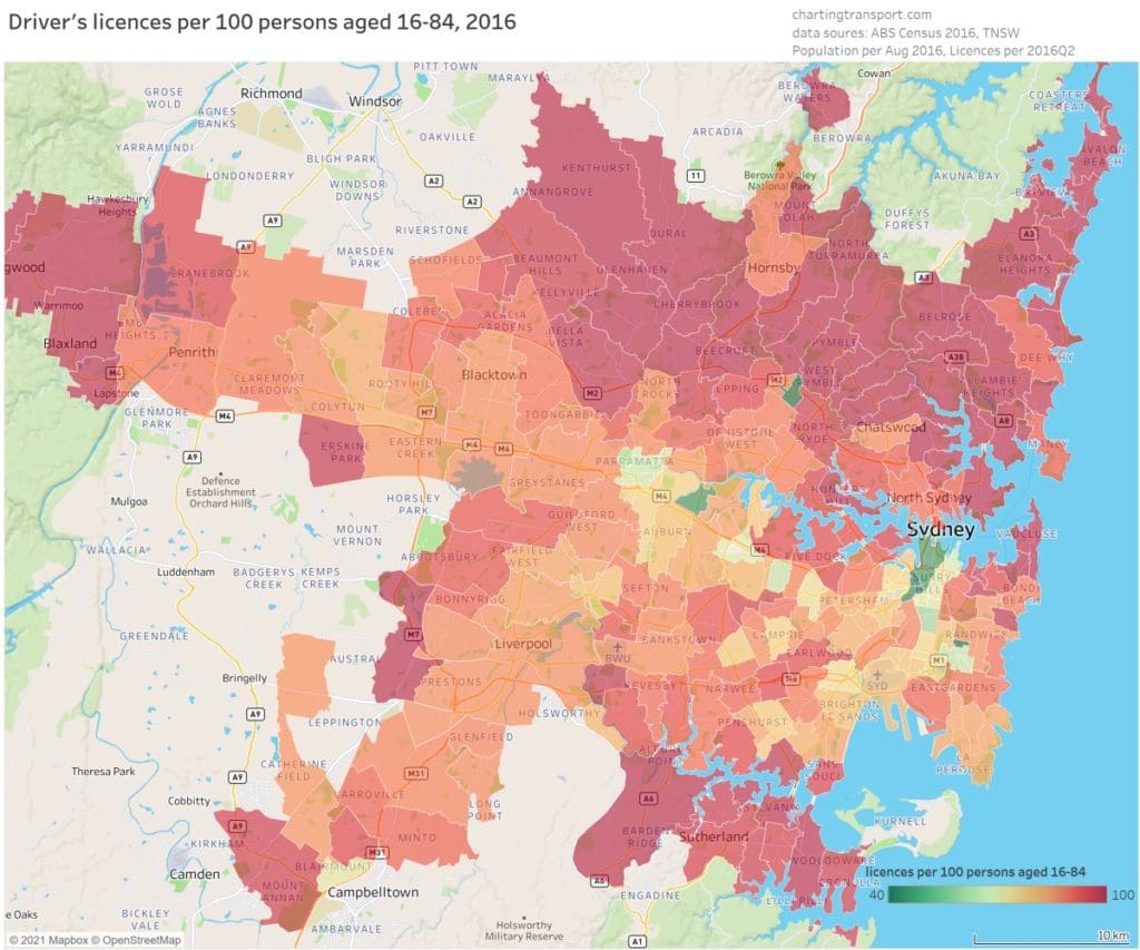
You can see from this study of drivers’ licences per 100 people that inner-city residents have significantly lower rates of holding drivers’ licences. It’s quite likely that this is inversely proportional to population density, ie the higher the population density, the lower the drivers’ licence rate.
Impact of Covid on Cycling Rates
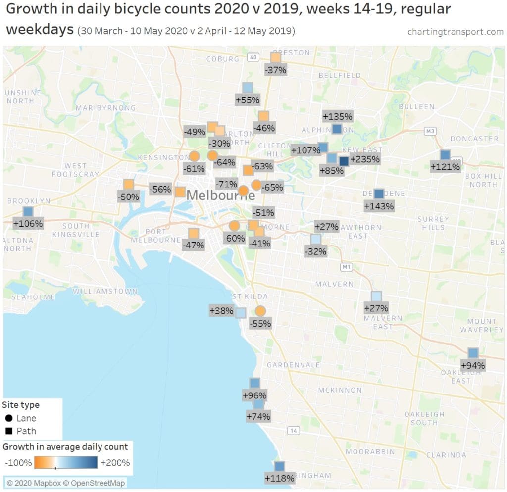
This map shows the change in cyclist numbers as measured by electronic counting stations for a comparable six week period in 2019 (pre covid) and 2020 during Melbourne’s first lockdown.
It shows that counters on commuting routes in and out of the CBD were significantly down. But counters on recreational routes out in the suburbs were significantly up.
Presumably, this reflects many people being locked out of their regular CBD jobs but riding locally for recreation.
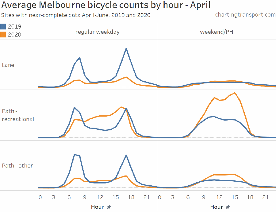
This animated chart reinforces this conclusion. You can see how the morning and evening commuting peaks in 2019 (the blue line) were flattened by covid (orange line) but how recreational cycling throughout the day grew.
Sobering Reality
This chart shows that Australia’s transport greenhouse gas emissions have increased 2 ½ times over the past 45 years. The slight dip at the extreme right of this line is the first effects of covid lockdowns. Clearly nowhere near enough in itself to counteract decades of steady increase.
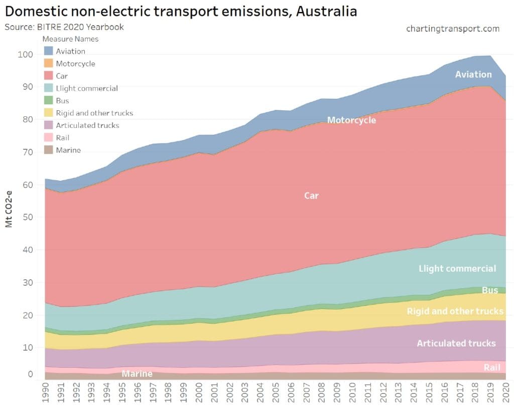
Breaking down the transport greenhouse gas emissions by sectors, you can see that cars are by far the largest cause. When added with all other forms of road transport (the next four coloured sections below cars) you can see that road transport accounts for about 90% of all Australian transport related greenhouse gas emissions.
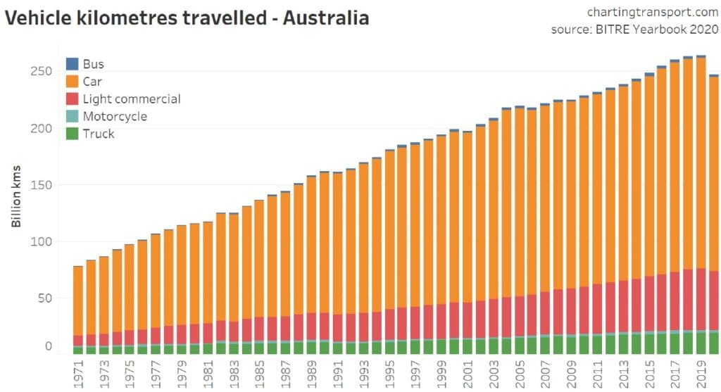
Looking at total vehicle kilometres travelled, it’s immediately obvious why cars are the biggest single greenhouse gas emitter. They account for far more kilometres driven than all other vehicle types combined. This chart is for all of Australia, not just cities, so would include a large amount of long-distance rural driving.
Here’s one good reason why motor vehicle usage has been inexorably growing year after year. The cost of purchasing cars (orange) and the overall cost of using them (red) have been coming down. Meanwhile, the cost of public transport (blue) has been rising significantly.
All of these costs are directly impacted by government policies, which could easily be altered, from an administrative point of view at least, to reverse these trends. The key question is whether future governments have the political will to take such actions for the sake of the environment, given the large number of voters who currently drive private motor vehicles that at present are almost entirely powered by fossil fuels.
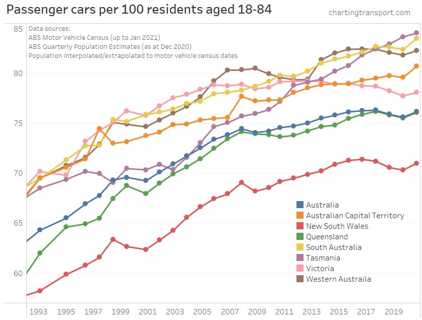
For all the talk of millennials turning away from cars, the total data shows only slight declines in recent years. Then all cities have spiked upwards in 2020. This has been a major covid trend – increased demand to purchase cars as people look to isolate and are encouraged not to use public transport. In fact, car supply has been short and used vehicle prices have been climbing at record rates.
Once again, New South Wales, impacted by Sydney with its far higher urban density and higher use of public transport, is the stand-out with ‘only’ 70 cars per 100 residents compared to well over 80 in some states, that co-incidentally have lower per capita incomes than NSW.
In fact, the two states with the highest rate of cars per 100 residents, Tasmania and South Australia are actually the two lowers states in that order, for GDP per capita.
Slivers of Hope for the Future
Now that we’ve thoroughly depressed you with the previous five charts relating to greenhouse gas emissions and causes. Let’s finish with at least some slivers of hope.
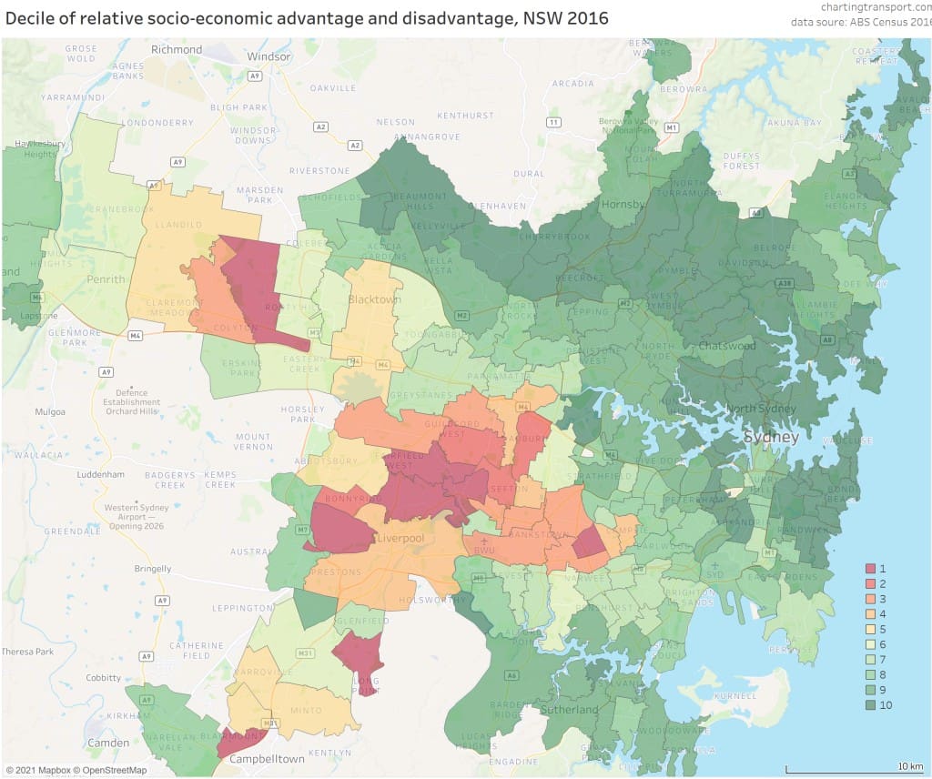
In many ways, you could say that this map is negative, rather than positive. Put bluntly it shows that in Sydney, the poor people live way out west, where it’s hotter than hell in the summer. Meanwhile the wealthy live in the inner city and the sea-side suburbs with their much milder climate.
If we showed the same map for Perth, it’s a mirror image, where the wealthy live in the western suburbs, which is their beachside and closer to the city, whilst the poorer live in their inland east.
Similar patterns, with only compass directions changing, apply in the other major capital cities.
So what are the positives from this map? Here’s two of our takes, which you’re welcome to dispute.
From a micromobility perspective, those in the denser, inner-city areas that are best suited to micromobility can well afford to buy and try. This is not saying micromobility is not a good idea everywhere, just that it works even better when travel distances are short and population densities are high.
Secondly, if you accept the pragmatic reality that those with higher incomes/educations tend to hold more positions of power and influence, across business, media and government, then because these influencers live in the denser areas, they’re more likely to be exposed to micromobility and be able to advance it, if they choose to do so.
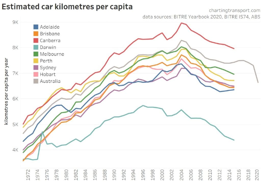
Even though previous charts in this article have shown that total Australia-wide vehicle kilometres travelled have grown, as have total greenhouse emissions. The situation in our major cities is more promising.
Vehicle kilometres per capita in our major cities have actually been declining since about 2004. Of course, populations have been slightly increasing in all of our cities, which means that total car kilometres in each city (not charted) would either be declining less rapidly.
These charts at least partly explain why vehicle kilometres per capita have been declining in our cities.
Growth of public transport, (the blue line) in almost all cases, been growing faster than population growth. Meanwhile, growth of car use (the red line) has in all cases been growing slower than population growth.
Given that our population is still drifting towards the major cities, this means that more people will hopefully be living with at least slightly smaller carbon footprints.
Conclusion
As we said in our introduction, this text gives only the briefest of non-scientifically based overviews and for more detail, we’d strongly recommend you visit Charting Transport, which we’ll link to again at the end of this article.
For advocates of micromobility, active transport, sustainable cities, climate change action and any number of other overlapping spheres, the charts in this article make for sobering reading.
But looking at things from a ‘glass half full’ perspective, there’s no physical or technological reason or constraint that requires Australia to either be in the situation it’s in now, or to stay there in the future.
There’s nothing stopping us from having better transport solutions if we chose to, both through our personal decisions and at local government, city-wide, state and national levels.
For more detailed descriptions of each chart, plus much more information, please visit Charting Transport.